|
|
Post by MsAng on Aug 21, 2008 13:33:55 GMT -5
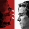
Hmm... it looks cleaner, and I like the .com logo over the biker boots... but something seems just a little...flat. Might be the font? Not sure yet what I think about the cartoon...  |
|
|
|
Post by MsAng on Aug 21, 2008 13:35:32 GMT -5
I think maybe I miss the tickets??
|
|
|
|
Post by The Movie Mark on Aug 21, 2008 14:43:40 GMT -5
Which font? The .com font? That's easy to change. Maybe I need to float y'all some different versions and get feedback. I can try to find a place for the tickets. Not on the first page, but on other pages I want to include a menu on the left specific to whatever topic you're looking at. So perhaps the tickets can be used in the context. Looking forward to more feedback...
|
|
|
|
Post by MsAng on Aug 21, 2008 15:07:24 GMT -5
I figured it out... I don't like the silver menu bar at the top. Looks too corporate.
Sure, tickets on the left sound good to me...
anybody else?
|
|
Buffy
Junior Movie Mark
 I have to return some videotapes.
Posts: 42
|
Post by Buffy on Aug 21, 2008 18:11:52 GMT -5
Looks nice. :) I do agree that the font needs to be changed over the boots, though. It just looks slightly off. But then again, when I'm working with font on images it takes me forever to find a perfect one. :X LOL
Yeah, maybe it does look a little corporate, but it'll just take a while for all of us to get used to the change. I think it looks pretty neat. Good job, Johnny! And I like the cartoon Johnny. Cute! :P
|
|
|
|
Post by MsCali on Aug 22, 2008 1:49:53 GMT -5
I think the problem with the text over the boots is that it doesn't really look centered. The dot makes it look like a space between mark and com, and that makes it look off balance. If the boots are moved to either before or after the text (a strong block text would look cool with that - the current font looks a little too "word art" and not as professional as the rest of the site in my opinion) it would probably look less 'off' (or, just leave .com off and have it say 'The Movie Mark' centered over the boots. I would still change the font though).
I like the rest of the look though! I'll miss this old site, but the new one looks great! I wasn't sold on the "corporate" navigation bar across the top, but the more I look at it, the more I like it.
As long as there is easy navigation, and the site looks simple & polished, I think it will be great. I like that you are keeping the same basic color scheme too.
|
|
|
|
Post by MsAng on Aug 23, 2008 9:45:04 GMT -5
I really like the new movie review format--- looks sharp and fun!!
|
|
|
|
Post by MsCali on Aug 23, 2008 16:17:39 GMT -5
Me too! |
|
|
|
Post by tangentgirl on Sept 12, 2008 16:06:17 GMT -5
more than willing to donate some fundage for the (TMM 2.0) cause. perhaps for a large enough donation I can get my tee-shirt.  (like when you donate $100 to PBS and get a totebag) ;D |
|
|
|
Post by MsCali on Sept 12, 2008 19:52:19 GMT -5
JB, you still need to set up a Cafe Press store!
Oh, btw...I really like the boot print score on the reviews now!
|
|
|
|
Post by The Movie Mark on Sept 13, 2008 13:03:01 GMT -5
Thanks Ms. C! And the Cafe Press store will definitely be a new feature of the new site. The shirts will look much better with the new logo, etc.
And I like your idea, TG, of offering some sort of incentive for different levels of donation. I'll be giving that some thought.
|
|
|
|
Post by shaneo6930 on Sept 18, 2008 16:39:42 GMT -5
Really love the new style of review. The bootprint rocks, as do the little comments about the film above each section of the review.
|
|
|
|
Post by tangentgirl on Sept 18, 2008 18:18:46 GMT -5
I agree with Shane....LOVE, LOVE, LOVE... the size 11? biker boot print. For those who are to lazy to read your witty reviews or those who are short on time... it's a nice quick glance guide. (Along the lines of "two thumbs up", if that makes sense.) Anyway... kudos! (On the site and on the recent Win ) |
|
|
|
Post by trantee on Sept 23, 2008 5:55:32 GMT -5
All i can think of, is J.B. is his seat, behind his pc (or is it in front of  tapping his fingers together, says "eeeeeexcellent"  I think it's gonna look great. |
|


 tapping his fingers together, says "eeeeeexcellent"